Tape Ad Design Guide
- Pre-Printed Grocery Store receipts that advertise business near the grocery store
- Top Categories: Quick Serve Restaurants, Hair/Nail Salons, Car Washes, Auto Car
- Full Color
- Single Size (85%): 2.75” X 1.75” Double Size (15%): 2.75” X 3.6”
- Ads should Appeal to new and existing customers of the business with an “Offer”
- Single Offers are better. Single ads should be limited to 2 offers and 4 on a Double
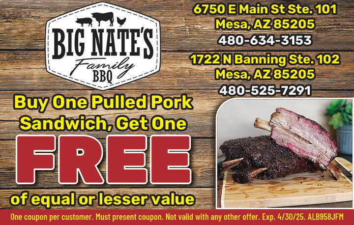
- Name and Imagery that defines WHAT the Business is.
- LOGO should serve this function. However, if it doesn’t other imagery may be needed.
- Brand Colors should be complimented through out the ad
- Use Contrast to set text apart, not devices (like shadows). This make the design look “clean”
- Limit to 4 Colors for Brand (excluding images)
- Tools like this one from Figma can help you select your color scheme.
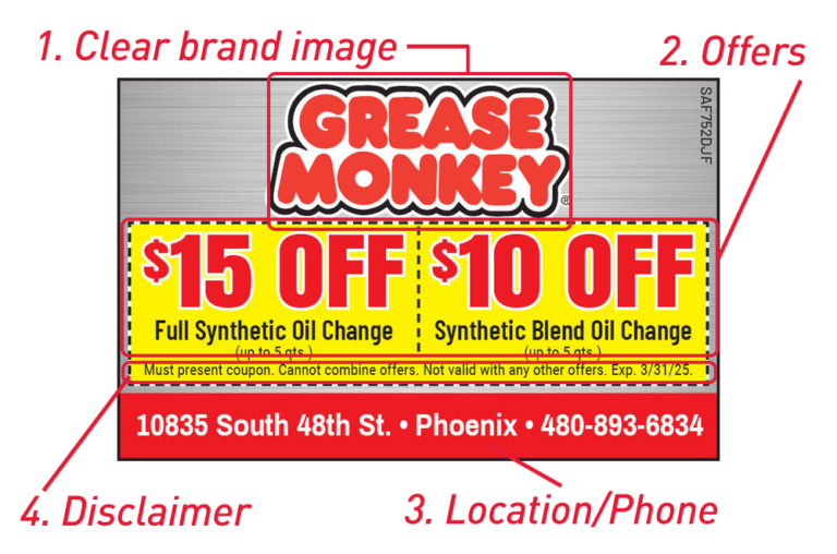
- Information Hierarchy is the visual ranking of different elements in a design
- BRAND – especially for well known brands, Use imagery and name for lesser-known brands
- OFFER – Generally Discount in this order: FREE, BOGO, $ OFF, % OFF
- USP (Unique Selling Point) – E.g. Free Delivery
- LOCATION/CONTACT information – When to have location vs. phone number and only one or the other. Assume they will Google you!
- EXPIRATION and TERMS
- BARCODE only if required!!
- No QR codes on Single Sized Ads
- ENFORCE THE INFORMATION HIERARCHY
- Use Negative Space & Layout to highlight More Important Information
- 4 Font Sizes Rule: Titles, Headers, Copy, T&C (Terms and Conditions)
- Use Current and Consistent Typography and Colors
- No more than 3 Fonts on one ad
- Use Updated Fonts and ”The Classics” only, unless you need to match the logo
- Learn about the latest font trends at FontFabric
- Minimize Drop Shadows. See this blog post from designer Mariah Althoff for suggestions on drop shadows
- Try to avoid dashed lines around “coupons”
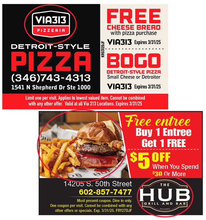
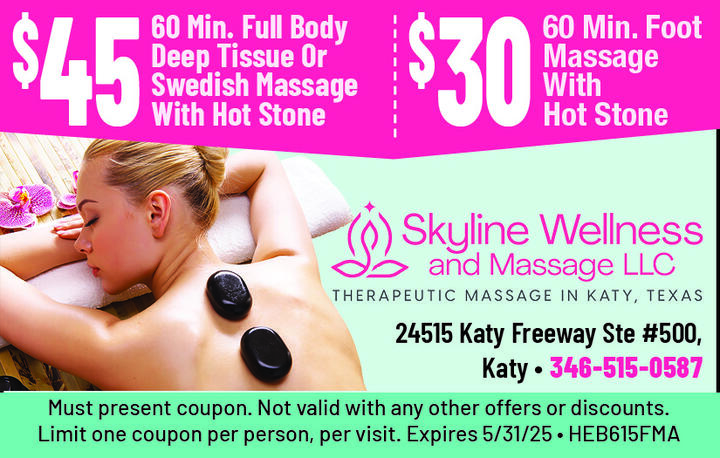
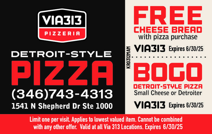
This can also be combined with a minimum spend, $5 OFF Any Order $20 or More
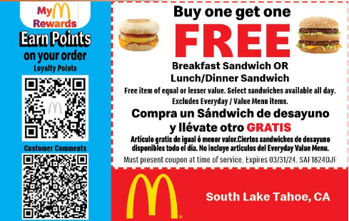
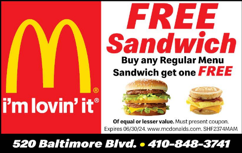
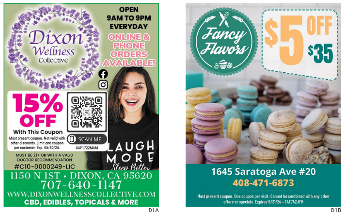
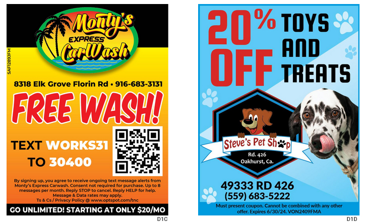
Good examples:
- Free Med 1 Topping Pizza with $25 min Purchase
- BOGO!
Can include a minimum spend, e.g. 20% OFF Any Order of $50 or More
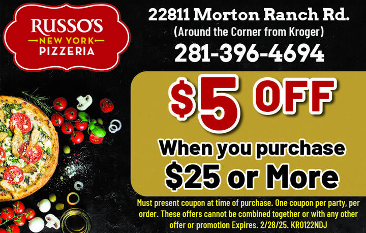
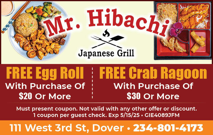
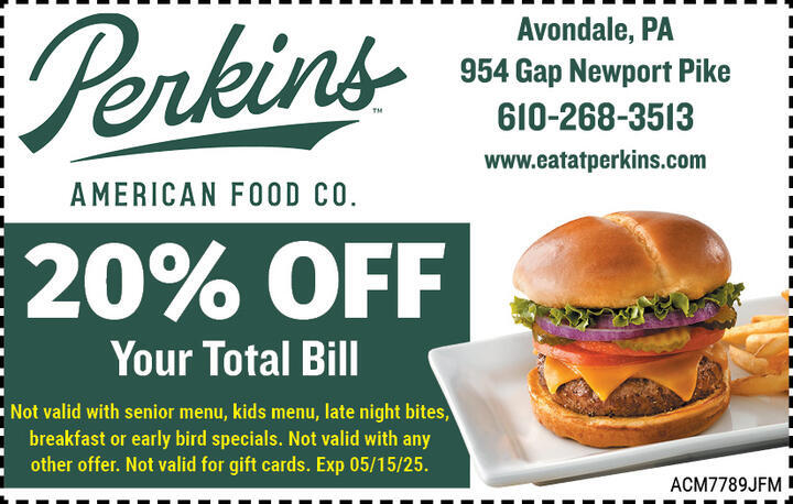
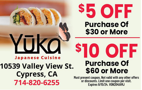
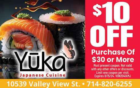
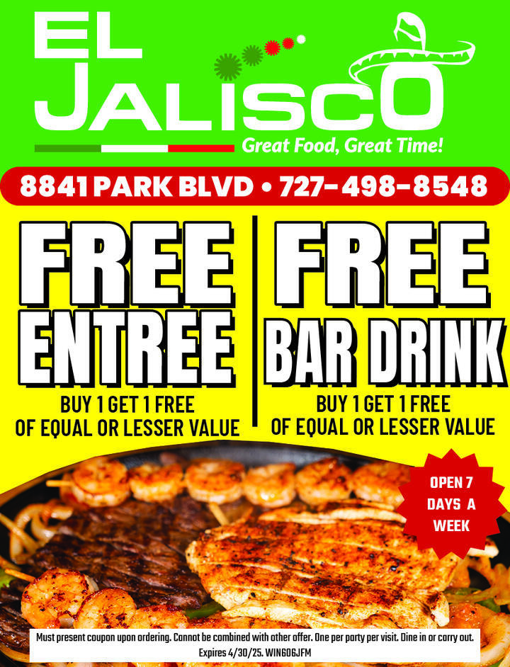
- Large, clear logo / business name
- Vibrant pictures
- Large, bright, substantial offer
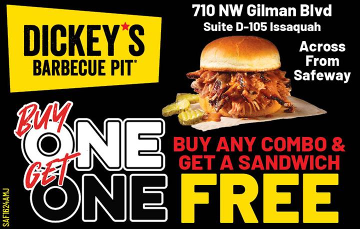
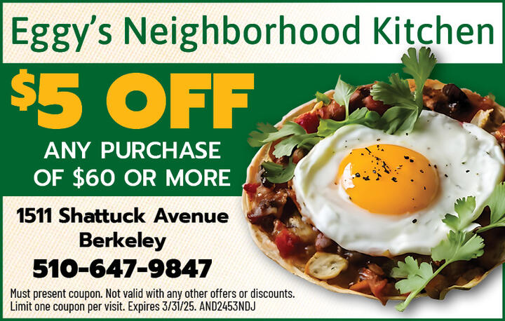
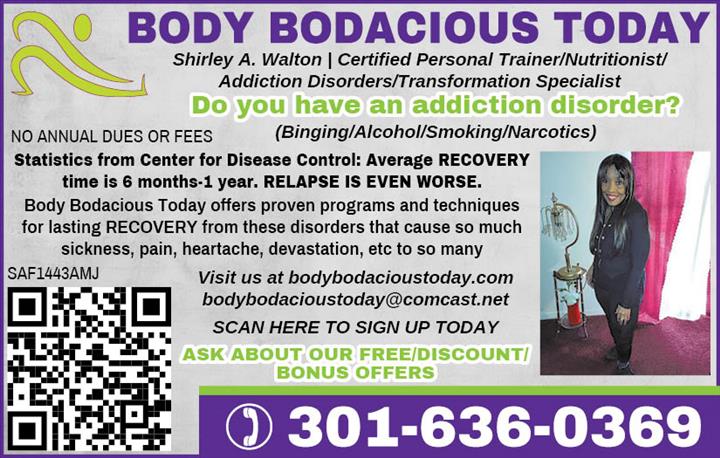
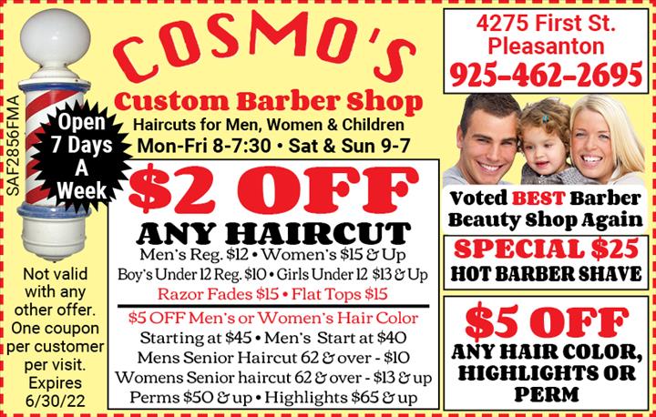
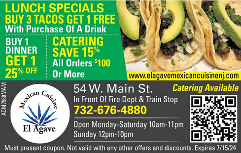
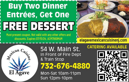
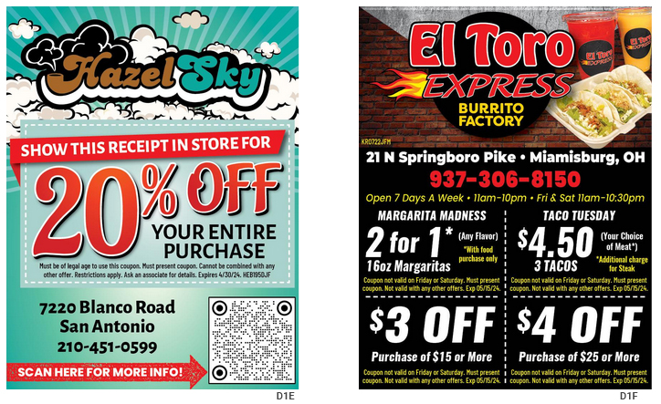
- Too much info
- Poor quality photos
- Logos lost in ad
- No offer / offer not standing out
