Tape Ad Design Guide
- Pre-Printed Grocery Store receipts that advertise business near the grocery store
- Top Categories: Quick Serve Restaurants, Hair/Nail Salons, Car Washes, Auto Car
- Full Color
- Single Size (85%): 2.75” X 1.75” Double Size (15%): 2.75” X 3.6”
- Ads should Appeal to new and existing customers of the business with an “Offer”
- Single Offers are better. Single ads should be limited to 2 offers and 4 on a Double
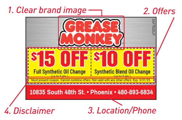
- Name and Imagery that defines WHAT the Business is.
- LOGO should serve this function. However, if it doesn’t other imagery may be needed.
- Brand Colors should be complimented through out the ad
- Use Contrast to set text apart, not devices (like shadows). This make the design look “clean”
- Limit to 4 Colors for Brand (excluding images)
- Tools like this one from Figma can help you select your color scheme.
- Information Hierarchy is the visual ranking of different elements in a design
- BRAND – especially for well known brands, Use imagery and name for lesser-known brands
- OFFER – Generally Discount in this order: FREE, BOGO, $ OFF, % OFF
- USP (Unique Selling Point) – E.g. Free Delivery
- LOCATION/CONTACT information – When to have location vs. phone number and only one or the other. Assume they will Google you!
- EXPIRATION and TERMS
- BARCODE only if required!!
- No QR codes on Single Sized Ads
- ENFORCE THE INFORMATION HIERARCHY
- Use Negative Space & Layout to highlight More Important Information
- 4 Font Sizes Rule: Titles, Headers, Copy, T&C (Terms and Conditions)
- Use Current and Consistent Typography and Colors
- No more than 3 Fonts on one ad
- Use Updated Fonts and ”The Classics” only, unless you need to match the logo
- Learn about the latest font trends at FontFabric
- Minimize Drop Shadows. See this blog post from designer Mariah Althoff for suggestions on drop shadows
- Try to avoid dashed lines around “coupons”
This can also be combined with a minimum spend, $5 OFF Any Order $20 or More
Good examples:
- Free Med 1 Topping Pizza with $25 min Purchase
- BOGO!
Can include a minimum spend, e.g. 20% OFF Any Order of $50 or More
- Large, clear logo / business name
- Vibrant pictures
- Large, bright, substantial offer
- Too much info
- Poor quality photos
- Logos lost in ad
- No offer / offer not standing out
DON’T
Photo too small
Muted color
Offers not significant
DO
Great photo
Bright colors
Large, significant offer
DON’T
Too much information
Photos, brand, offer too small
DO
Large offer
Less is more
DON’T
Too much information
Too many offers for a single ad
Logo is small
DO
Single large, substantial offer
Larger logo
Logo Dos and Don’ts
Logos are very important!!! The logo is the face of a business. It’s important that they are done correctly to properly represent your customers business.
DO
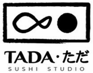
This logo is not blurry and has a clean background.
DON’T
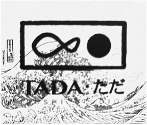
This logo is just a picture taken of their menu. It’s fuzzy and low resolution
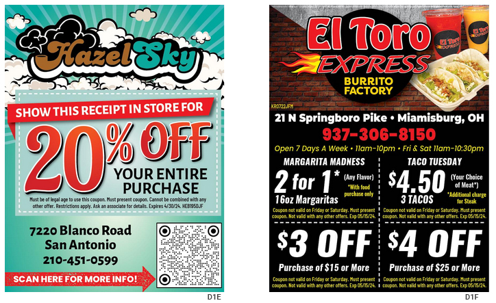
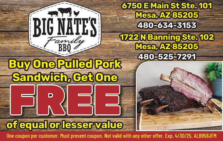
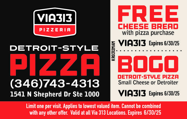
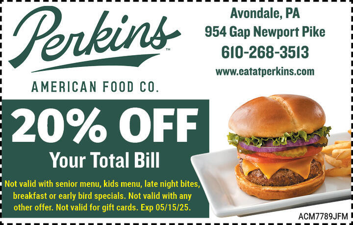
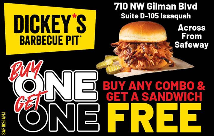
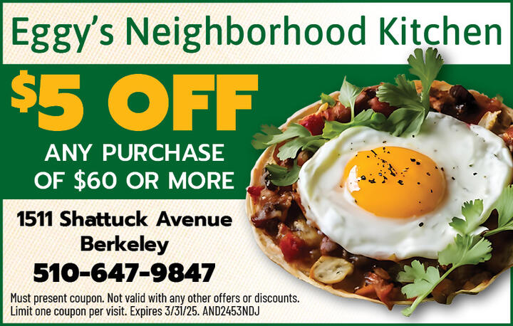
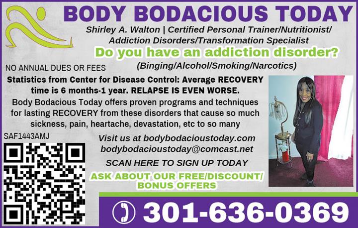
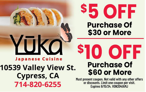
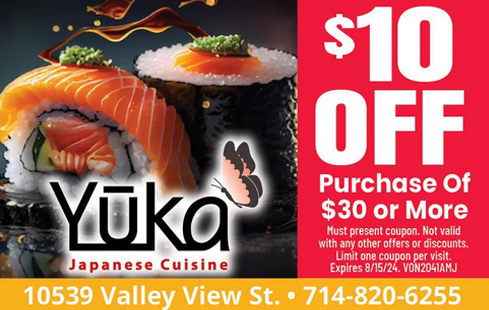
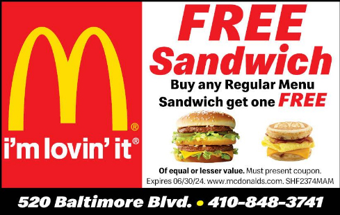
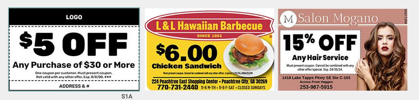
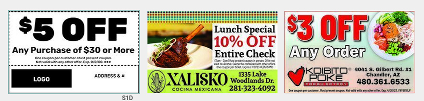
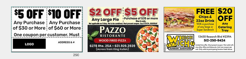
Single Ad
Rectangle logo top left with 1 offer
Rectangle logo top right with 1 offer
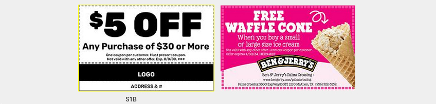
Single Ad
Horizontal logo top 1 offer
Horizontal logo bottom with 1 offer
Single Ad
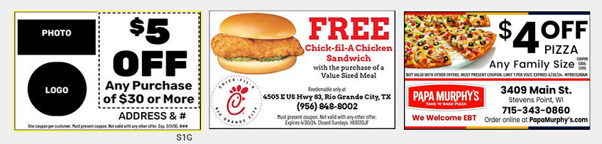
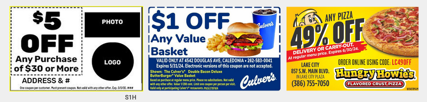
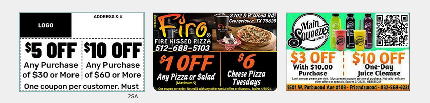
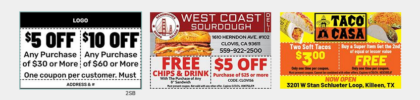
Rectangle logo (bottom right) with 1 offer
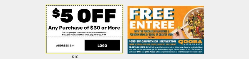
Rectangle logo (bottom left) with 1 offer
Single Ad
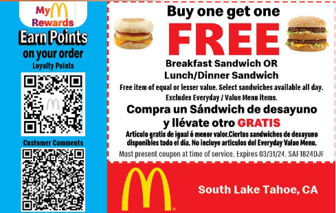
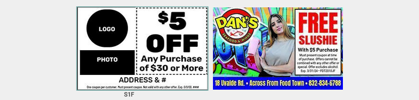
Circle logo (top right) with 1 offer
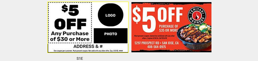
Circle logo (top left) with 1 offer
Single Ad
Circle logo (bottom right) with 1 offer
Circle logo (bottom left) with 1 offer
Single Ad
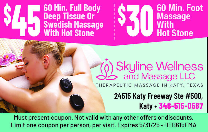
Logo and photo top, location and 1 offer below
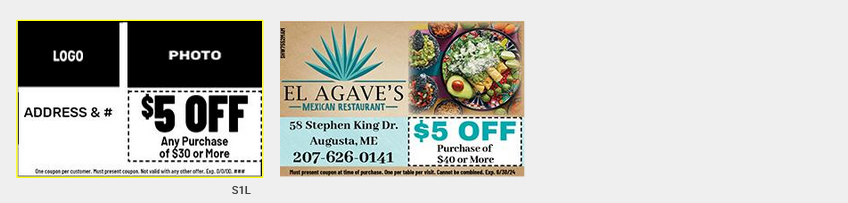
Logo and photo left, 1 offer right
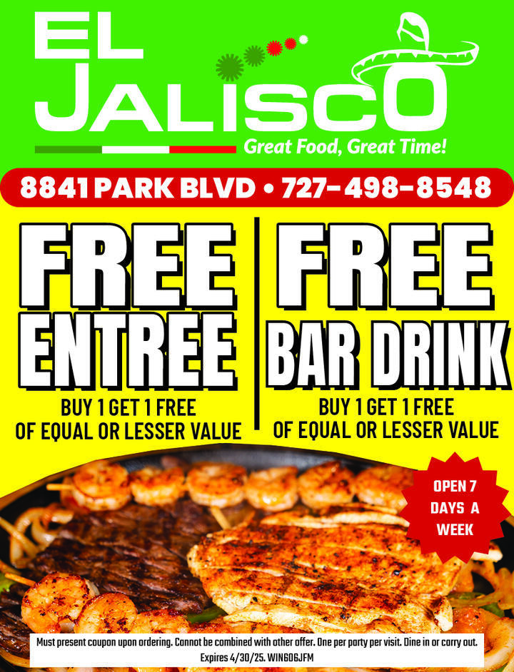
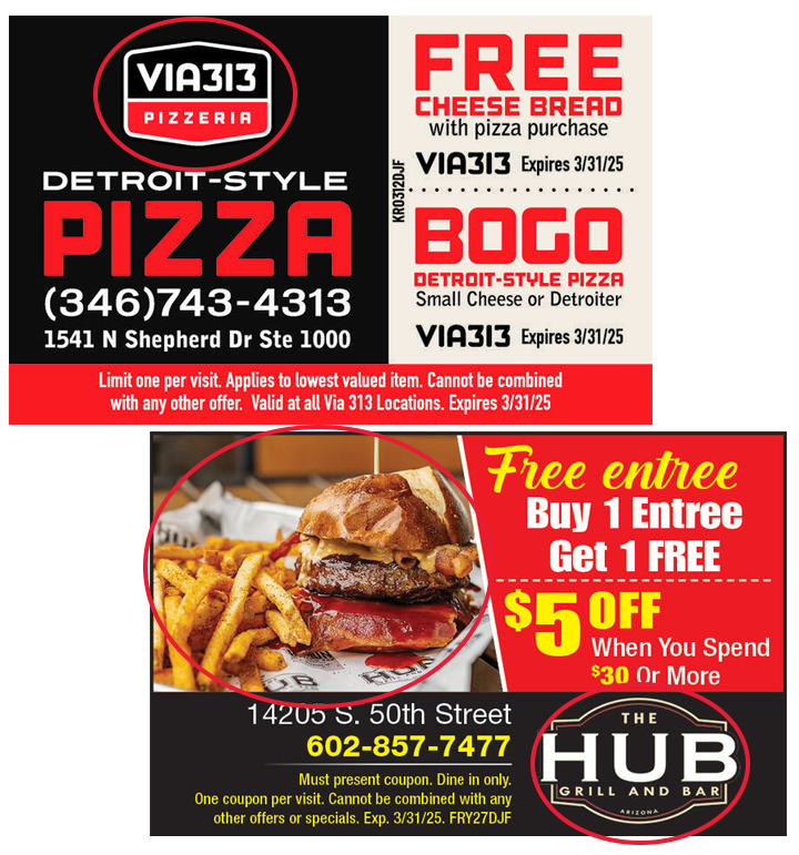
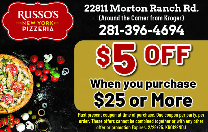
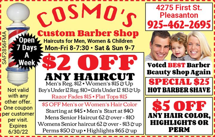
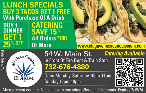
Single Ad
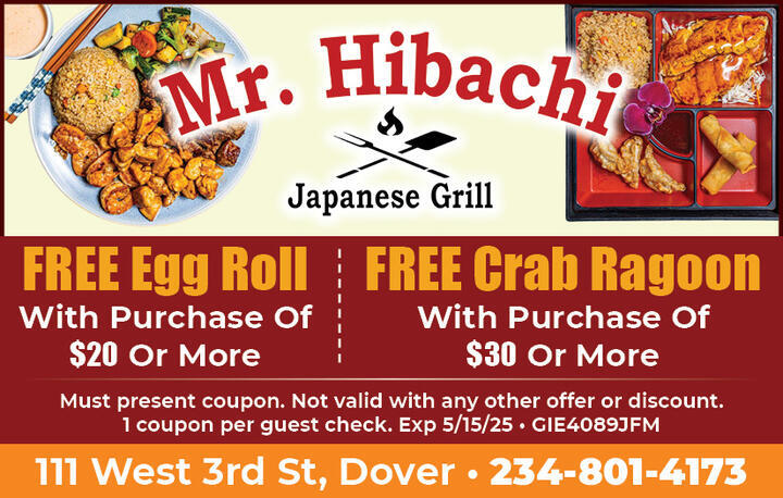
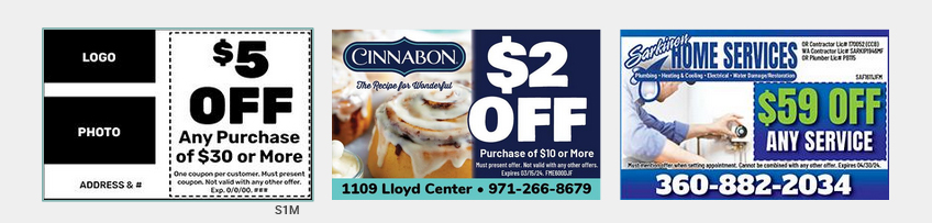
Logo top left, 2 offers
Logo top, 2 offers
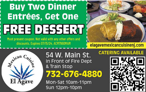
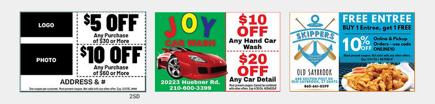
Single Ad
Logo bottom left, 2 offers
Logo and photo left, 2 offers
Double Sized Ad
Double Sized Ad
Double Sized Ad